Originally posted on kirschsubstack.com by Steve Kirsch, July 20, 2023
I’m going to drill into more detail on this analysis of the CDC “gold standard” database which shows that the vaccines were a huge failure. There is no way to put a positive spin on this.
Executive summary
The US Nursing Home data is the “gold-standard“ record level data for what happened in nursing homes after the COVID vaccine rolled out.
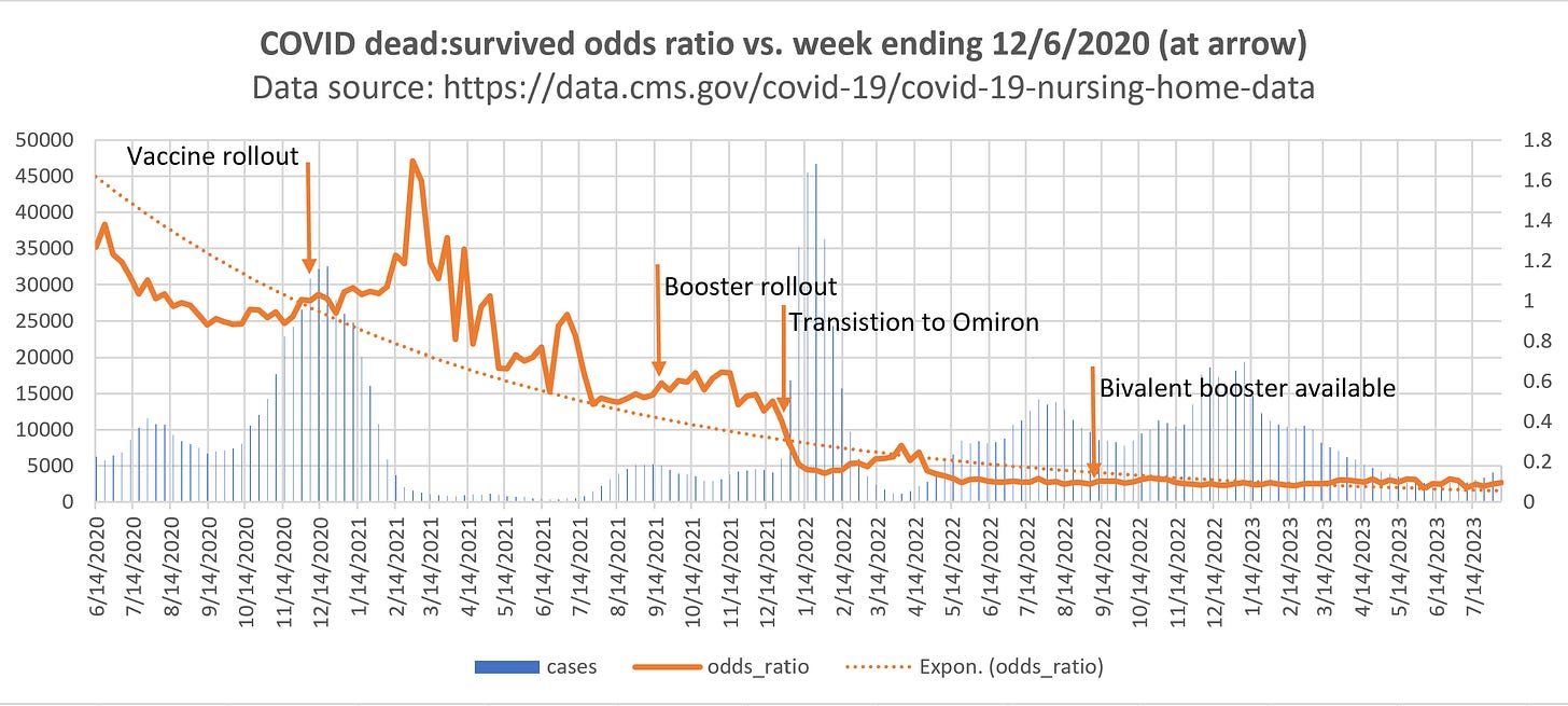
The signal from this data is clear and unambiguous: both the primary series and booster COVID vaccines increased the risk of death from COVID. The bivalent vaccines did absolutely nothing for the elderly (at least it didn’t make things worse, but it didn’t make things better).
The two things that reduced the infection fatality rate (IFR) were:
- Natural immunity (everyone had had COVID one or more times)
- The arrival of the much less deadly Omicron strain as the dominant strain in late December 2021
We can see both effects very clearly in the data shown in Figure 1 above.
This is why the CDC isn’t touting this database as proof that the vaccines work. Neither is anyone on the pro-vax side of the narrative despite the fact that this data has been in public view for 2 years now.
So since nobody from their side wanted to analyze the data, I thought it would be a good idea if someone from our side took a look.
The reason why they never wrote about this to prove their case is that it shows the opposite. The so-called “misinformation spreaders” have been right all along: the vaccine clearly significantly increased the risk of an elderly person getting COVID for around 4 months. This is a huge problem because this was the time when the vaccine was supposed to be most effective (since we now know from FOIA requests that the FDA knew that the vaccine protection waned after 4 months).
Health officials claimed the vaccine could reduce risk of death by 10x. It’s right here in this tweet from an Australian government health authority NSW Health on August 17, 2021:

The data they never told us about (the US Nursing Home data) shows a completely different story: it did the opposite and increased the risk of death by as much as 1.6 times higher odds of dying.
The attempts to attack my analysis, to date, are addressed here. They are weak hand-waving arguments with no evidentiary support. At no time did anyone ever justify their arguments with any numbers derived from the data. None of the attackers will publish their “correct” analysis of this data or their investigations showing anomalies.
The fact is that this is “gold standard” data. It doesn’t get any “closer to the source” than this. There were over 2M records to analyze from over 15,000 elderly care facilities in the US. These are large numbers and the effect size was huge.
The Fisher exact p-value for the 1.7 OR peak on 2/28/21 is 2.6e-109 and the Z-score for the odds ratio is 23.53. In other words, this difference didn’t happen because I cherry picked a result or it happened by chance. It was caused by something. If it wasn’t the vaccine, what caused this statistically significant difference in the rate of death from the virus (it was the same variant as before the vaccines rolled out).
Equally important is that Apple Valley Village had a 0% death rate from COVID prior to the vaccine rollout: 26 infections and not a single death. Just 3 weeks after the week of the shots, they had 90 COVID infections which resulted in 28 deaths from COVID. My hypothesis can easily explain that. Theirs cannot. So you can throw all the FUD you want at the Nursing Home data, but the bottom line is that this one anecdote is very powerful because it is verifiable in the database and with employees, but it cannot be explained how the death rate in this nursing home suddenly got at least 9X worse after the shots rolled out that should have made the death rate 10X better. That is a 70X swing. This is why Professor Morris simply ignores this because he cannot explain it. In science, you can’t ignore data you don’t like. You have to be able to explain it or admit you cannot. Morris does neither.
Don’t you find it strange that this data has been publicly available for two years now and not a single pro-vaccine advocate has analyzed it and is touting it as “proof” the vaccines work?
At this point, the medical community has a choice: embrace the data and admit you were wrong or try to fight it.
History will not look kindly on attempts to dismiss this data.
The first rule of holes: if you find yourself in a hole, stop digging.
They are in a big hole. What will they do now?
Data availability
Code: You can find everything in my github repo here.
Nursing home data: You can download the data from my repo or directly from CMS.
Now, where are the repos of others who have analyzed this data? They do not exist as far as I know. How is that possible? Why can’t we see their work?
Latest update (9/9/23)
I analyzed every nursing home 12 weeks pre-vax vs. 12 week post-vax. There was a 6.5 odds that the RRR got worse than better on an individual facility basis (over 15,000 facilities in the database).
That’s pretty stunning but not surprising given the aggregate chart above.
See this file in my Github for details (analysis 2 tab).
You are welcome to disagree if you can show me your code and analysis.
You need to explain thousands of providers like #015075 in Alabama with 216 beds. In the 12 weeks before the vaccine rollout, there were 37 cases and 0 deaths. In the 12 weeks after the rollout, there were 35 cases and 29 deaths. Explain that one and thousands more like it if you think I’m wrong.
Key documents
Preparing for COVID-19 in Nursing Homes shows that the policy in effect on November 20, 2020 and beyond was to test all new admissions into nursing homes and anyone who is symptomatic. I verified this practice was followed by talking to people who work in the nursing care homes. So the claim that people who transferred into nursing homes didn’t get tested is without evidentiary support.
Boosters were rolled out starting on September 20, 2021. See: Nursing homes charging ahead to administer COVID-19 vaccine booster shots
The bivalent booster was first available in the United States nearly one year later on September 1, 2022.
Nursing homes site of 40% of US COVID-19 deaths shows that nursing homes are ground zero for the vaccine. If it doesn’t work there, it is a failure.
What I found
Everything is summarized in the Executive Summary at the start.
The key point is that, in aggregate, when compared to pre-vax infection fatality rates, the odds of death climbed for months after the vaccines were delivered when they were “supposed to” have fallen like a rock. In particular the odds of death ( deaths from covid:survivors from COVID) increased post-vaccine. So did the absolute risk reduction; it went south which means the vaccines increased your risk of death. In short, the vaccine made things worse. The reference point chosen (the week prior to vaccine rollout) is immaterial; the slopes all went the wrong way. There is no doubt about this. This is a huge failure of the vaccine.
In addition, the virus has mutated to Omicron which isn’t killing anyone. Boosters are silly. They should be ashamed of themselves for pushing this when there clearly isn’t a problem.

Could this analysis be wrong? Could the vaccine have saved lives?
No. Anecdotes like Apple Valley Village (mentioned above) are unexplainable.
The Pfizer Phase 3 clinical trial had more all-cause deaths in the treatment group than the placebo group, but the numbers were too small to be statistically significant. So the trials provide no visibility into the death “benefit.”
There are many others who have pointed out issues with the vaccines including this amazing video by John Beaudoin and the 1,200 articles I’ve written on my Substack.
Why did this happen?
Is there a biological basis for how the vaccine can make things worse? Yes!
The vaccine damages your immune system. See this article by Igor Chudov for a clinical trial done on kids with healthy immune systems.
Previous articles
See:
- US nursing home data shows clearly that the COVID vaccines made the elderly MORE likely to die from COVID. Whoops!
- UPenn Professor Jeffrey Morris tries to discredit me and fails…badly, very badly
The attempts to discredit the data and/or analysis
Here are the attempts to discredit my analysis of this data. At no point do any of these people point to the “correct” analysis showing that the data shows the vaccines reduced the death rate. Nor do any of the attacks actually have any numbers. They are all hand-waving attacks with no evidentiary support. The attack is in bold, the responses follow.
- There was a wave of infections. When infections go up, the IFR goes up. It’s just timing, not the vaccine. No, the data doesn’t support that. The IFR was relatively stable as infections went up and down. This is obvious from the plot above.
- You’re cherry picking your analysis window. The reference point in computing the OR and the ARR is completely arbitrary. I simply chose the most logical point: the week ending 12/6/20, which is just before the vaccines were publicly available for the elderly. Pick any other point and you’ll see that the OR increases and the ARR decreases. This is a stupid attack.
- This is a CFR, not an IFR. Technically true, but practically speaking, this is as close to the IFR as you will ever get in real life. If it makes you happy, simply replace all instances of IFR with CFR. It doesn’t change anything. Nursing homes were required to test all incoming patients for COVID and they tested anyone who was symptomatic. None of this changed throughout the period. These rules were in effect well before the vaccines rolled out.
- Odds ratios can be unstable. Yes, but not in this case.
- Apple Valley Village (AVV) was cherry picked. It’s not typical. First of all, I have insider information from only 5 nursing homes. So I picked it out of the 5 because it was one of 3 where I had insider information. Also, they had enough COVID deaths to make it interesting. And it was in a state where I had access to the death records. So AVV was the only nursing home where I had a complete 360 degree view of an “interesting” case: 1) in the Nursing database, 2) had access to the death records, 3) had inside access to an employee, and 4) had enough cases. So to cherry pick, you have to start with a bunch of cherries. I had 5, but only 1 with full info. Not cherry picked. And besides, even if I had the same info for all 15,000 facilities, they all should be explainable. When I asked Professor Morris to explain my real world example, he refused to offer an explanation and instead accused me of “cherry picking.” Is that how science works? When you can’t explain the observation, you accuse the other person of cherry picking? They can’t explain this data; it doesn’t fit their hypothesis. That’s the problem.
- AVV deaths were due to the COVID wave in January 2021. The facilities were overwhelmed; that’s why the death rate rose. No, the numbers don’t work out for you. The IFR for AVV was less than 1 in 30 before the vax. If the IFR remained flat, the 90 infections should have led to 3 deaths. But since the vaccine reduces death by 10X like NSW Health says, there should be 0 deaths. That wouldn’t overwhelm any system. How were there 30 deaths??And why aren’t you giving me any anecdotes supporting your hypothesis? Is that because there aren’t any?
- Your IFR is bogus because people could be transferred into the nursing home without being tested. Preparing for COVID-19 in Nursing Homes shows that the policy in effect on November 20, 2020 and beyond was to test all new admissions into nursing homes and anyone who is symptomatic. So the claim that people who transferred into nursing homes didn’t get tested is without evidentiary support.
- Infections went way down after the vaccines rolled out. If infections are falling the IFR can appear to be falsely inflated. Yes, that’s true if you don’t time offset the cases to match the deaths. I did a cross correlation between delayed cases (using current month and the 2 previous months) and achieved an r=.996 using weights .2, .6, and .2 which was designed specifically not to “overfit” the data. With that correction to cases, case rates can be falling or rising and the IFR will be relatively stable.
- When case rates are low, the IFR calculation can be inaccurate because ratios can be all over the place if infections are low; the law of large numbers no longer applies. My analysis focuses on the aggregated US data where this is not a problem. The p-values are absurdly small and the effect size is huge. And for the primary and booster shots, there was a clear cause and effect. Everything looked the way we expected it to look. If you have a specific issue that disqualifies the data, you need to show me exactly what it is with data and statistics, not a hand-waving argument.
- You don’t understand probability. Then why not show your analysis of the data?
- You didn’t disclose the disclaimer listed on the CMS website about why infections can be greater than cases. The disclaimer contains handwaving arguments with no evidentiary support that conflicts with what I know to be the case, e.g., nursing homes test incoming residents for COVID. There may be some exceptions, but the burden is on the challengers to show this effect is both real and significant. Hand-waving arguments don’t cut it.
- Cases come before deaths. You need to offset them to compute an accurate IFR. if cases are dropping, the time lag makes the OR computed on the same week exaggerated (makes it look more deadly even when it isn’t. I did that. If you think I got it wrong, show us your analysis.
- Why are you focusing on the US data? How do you explain the data in Sweden? Attempts to change the topic won’t work.
- Some facilities didn’t report deaths. Where is the evidence of this? There are certainly facilities who reported no deaths, but that could be because there weren’t any. Where is the proof that this attack changes the outcome?
- The PCR test is inaccurate. Yes it is, but that bias uniformly affected all reports and you cannot discredit this analysis by modeling this effect. If you can, show the analysis.
- Not everyone was tested for COVID. Agree. Only symptomatic cases were tested. This doesn’t change the results. If it does, show us.
- Some sites had more deaths than cases. If you filter these out, it doesn’t change the outcome.
If you want to read Professor Morris’s critique in his own words, you can find it here. Here are the quick answers to each item.
- I only need a consistent measure of the IFR. The fact that some cases and deaths aren’t reported is immaterial. It is the directionality that is key.
- The IFR came down when Omicron rolled out. It also comes down steadily as more people are infected and gain natural immunity. There is a survivor effect as well: the vulnerable die off. There is no evidence whatsoever linking the vaccine to the slow drop in IFR. If it was the vaccine, it would drop shortly after injection and it doesn’t.
- I only look at periods post primary vax and booster. These are not cherry picked. These are the areas of interest. If the vaccine worked, you’d see an immediate effect which wears off after 4 months. There’s no benefit there.
- I now lag the cases with a r-.996 between the lagged cases and deaths. The lag is 0, 1 week, and 2 weeks and gives that r value.
- The vaccine should have dropped the OR below the trendline. It went the wrong way. No spinning required. It’s obviously a problem.
- Natural immunity and survivor bias are constantly driving down the trendline shown. Omicron came on quickly and you can see it immediately drive down the OR line in late Dec 2021.
- I dismiss the effect of vaccination because 1) post vax, the rates went up and 2) there was a study recently done confirming that the vaccine damages your immune system, and 3) the Cleveland Clinic study confirmed that the more vaccines you got the weaker your immune system becomes thus explaining the higher rates of COVID in the vaccinated. If you have a better explanation for 2 and 3, let’s hear it.
I found his arguments lacking in any data or numbers to back them up. And he completely failed to explain AVV; he wouldn’t even attempt it.
I also invited him to submit to me his anecdote of a success case where the IFR in the nursing home dropped by 9X or more. I’d love to see it. After all, there should be hundreds of such homes. Can he name one?
The NSW government promised the OR would drop like a lead balloon
As noted above, the NSW Health authority claimed that risk of death drops by 10X. I’d love to see how the OR of death goes to .1 after the vaccine. Where is the data?
Where is their analysis of the CMS Medicare data?
This is gold standard data. They should be touting it. It’s been up for 2 years. Nothing. Not a peep. Nobody touched it. It’s basically a third rail for the narrative.
40% of the COVID deaths were in US nursing homes, so this is the #1 demographic to examine. The data was there. Why did they ignore it?
If there is a mortality benefit, where is the benefit curve post-vax and why is this kept hidden?
Where is their curve of the odds ratio of death from COVID post vaccine?
I haven’t seen it anywhere.
I asked Professor Morris for the correct IFR since he claims mine is wrong. He could not provide it.
If he doesn’t know the correct numbers, how can he know my numbers are wrong?
For more info
See my previous article where it talks about the only paper published referencing this data
See also my Twitter post:

Summary
The vaccines made things worse for the very population that it was supposed to help.
That’s why nobody ever published a favorable analysis of the US Nursing Home Data even though it has been out for 2 years.
The vaccines shouldn’t be used by anyone, especially those with a compromised immune system. It damages your immune system. People with a damaged immune system will be left with an even more damaged immune system.
When will the medical community acknowledge they made a huge mistake?